DOQQ, or Digital Orthophoto Quadrangle Quads, is an electronically reassembled image from an aerial photograph. It is able to take an image and remove certain factors that impede visibility and cleanliness of the lines. The image below is a final transitional image of an area with high terrain relief that has been improved by the DOQQ process.
Saturday, July 20, 2013
DOQQ
http://www.geomart.com/products/geodata/
DOQQ, or Digital Orthophoto Quadrangle Quads, is an electronically reassembled image from an aerial photograph. It is able to take an image and remove certain factors that impede visibility and cleanliness of the lines. The image below is a final transitional image of an area with high terrain relief that has been improved by the DOQQ process.

DOQQ, or Digital Orthophoto Quadrangle Quads, is an electronically reassembled image from an aerial photograph. It is able to take an image and remove certain factors that impede visibility and cleanliness of the lines. The image below is a final transitional image of an area with high terrain relief that has been improved by the DOQQ process.
DEM
http://tahoe.usgs.gov/DEM.html
DEM model is a raster based image produced through the help of software, most commonly used by the USGS. The DEM model below shows an overhead image of the Lake Tahoe basin.

DEM model is a raster based image produced through the help of software, most commonly used by the USGS. The DEM model below shows an overhead image of the Lake Tahoe basin.
Triangle Plot
http://en.wikipedia.org/wiki/Ternary_plot
A triangle plot, or ternary plot, or de Finetti diagram, is a plot whose data set functions along three variables and sum to a constant number. Because of this, it is a visual display of the ratios of the three variables within an equilateral triangle. The plot below shows the flammability of methane as a function of two other variables, which are the presence in what quantities of Nitrogen and Oxygen.

A triangle plot, or ternary plot, or de Finetti diagram, is a plot whose data set functions along three variables and sum to a constant number. Because of this, it is a visual display of the ratios of the three variables within an equilateral triangle. The plot below shows the flammability of methane as a function of two other variables, which are the presence in what quantities of Nitrogen and Oxygen.
Windrose
http://en.wikipedia.org/wiki/Wind_rose
A windrose is a visual graph used by meteorologists to show the strength, direction and frequency of wind at a given location. It looks similar to a star plot, but functions more like a bar graph stemming from a single point of origin. The plot below shows the wind speed windrose at LaGuardia Airport in Manhattan.

A windrose is a visual graph used by meteorologists to show the strength, direction and frequency of wind at a given location. It looks similar to a star plot, but functions more like a bar graph stemming from a single point of origin. The plot below shows the wind speed windrose at LaGuardia Airport in Manhattan.
Climograph
http://en.wikipedia.org/wiki/Climograph
A climograph is a clever graph that shows correlations of basic characteristics of an areas climate together. It typically will displace average rain fall and precipitation compared to average temperature in corresponding months. Below is a climograph of Calcutta that shows monthly temperatures and precipitation.

A climograph is a clever graph that shows correlations of basic characteristics of an areas climate together. It typically will displace average rain fall and precipitation compared to average temperature in corresponding months. Below is a climograph of Calcutta that shows monthly temperatures and precipitation.
Population Profile
http://geo.acaps.org/docs/435
A population profile is a visual map that is used in demographics and shows the number of people as a function of age. Primarily, population profiles are used when a population's sustainability is analyzed, and can reveal things like young-heavy or old-heavy population loading is present. The profile below shows the age distribution in Mali last year.

A population profile is a visual map that is used in demographics and shows the number of people as a function of age. Primarily, population profiles are used when a population's sustainability is analyzed, and can reveal things like young-heavy or old-heavy population loading is present. The profile below shows the age distribution in Mali last year.
Scatter Plot
http://en.wikipedia.org/wiki/Scatter_plot
A scatter plot uses cartesean coordinates to display any number of points as they relate to two variables, charted along the x and y axis. They are used for a finite data sets that have most likely not been taken regularly as a function of time. The plot below is a good example of a scatter plot, because it shows it's power as a tool for determining the flow of a set of data and makes that suggested correlation easily digestible for the reader.

A scatter plot uses cartesean coordinates to display any number of points as they relate to two variables, charted along the x and y axis. They are used for a finite data sets that have most likely not been taken regularly as a function of time. The plot below is a good example of a scatter plot, because it shows it's power as a tool for determining the flow of a set of data and makes that suggested correlation easily digestible for the reader.
Index Value Plot
http://www.drroyspencer.com/2013/02/
An index value plot does not give exact data points and instead plots onto a line graph and indexed value. It gives a normal line off which the reader can base the other distributed indexed data on. This index value plot shows the degree of variation in anomalies from a TRMM microwave imager as it relates to time.
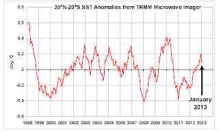
An index value plot does not give exact data points and instead plots onto a line graph and indexed value. It gives a normal line off which the reader can base the other distributed indexed data on. This index value plot shows the degree of variation in anomalies from a TRMM microwave imager as it relates to time.

Parallel Coordinate Graph
http://www.frontiersin.org/quantitative_psychology_and_measurement/10.3389/fpsyg.2011.00011/full
A parallel coordinate graph is a graph that on a single range plots every point of data given in any data set, and as such, easily produces a see-able pattern if one exists in the data. Maximums and minimum points of data are easy to see and identify the correlating vertical or horizontal point on the x or y axis.

A parallel coordinate graph is a graph that on a single range plots every point of data given in any data set, and as such, easily produces a see-able pattern if one exists in the data. Maximums and minimum points of data are easy to see and identify the correlating vertical or horizontal point on the x or y axis.
Histogram
http://en.wikipedia.org/wiki/Histogram
A histogram is a type of bar graph that shows an estimation of the probability distribution of a continuous variable. The bars displaying the information are adjacent and are shown over 'bins' of ranges. The graph below shows the arrivals in a given train station and their frequency over time.

A histogram is a type of bar graph that shows an estimation of the probability distribution of a continuous variable. The bars displaying the information are adjacent and are shown over 'bins' of ranges. The graph below shows the arrivals in a given train station and their frequency over time.
Correlation Matrix
http://www.kltprc.net/policynotes/Gifs/Tab_005A_4.htm
Correlation Matrix is a matrix giving the relationship of all different pairs of data sets in a rectangular array of quantities. It is organized by rows and columns and is held as a single element.
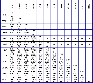
Correlation Matrix is a matrix giving the relationship of all different pairs of data sets in a rectangular array of quantities. It is organized by rows and columns and is held as a single element.

Similarity Matrix
http://tomcat.esat.kuleuven.be/txtgate/images/distmat.png
A similarity matrix is a matrix of scores which displays any similarity between any two data points on the matrix. The higher value score, the more points of similarity between the data sets. The opposite is true for lower scores. The matrix below compares similarity between gene sequences in two organisms.
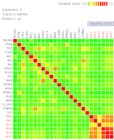
A similarity matrix is a matrix of scores which displays any similarity between any two data points on the matrix. The higher value score, the more points of similarity between the data sets. The opposite is true for lower scores. The matrix below compares similarity between gene sequences in two organisms.

Stem and Leaf plots
http://www.yale.edu/ynhti/curriculum/units/2008/6/08.06.09.x.html
Stem and Leaf plots are a clever but simple way of tallying and displaying large volumes of numbers so as to convey to the viewer the actual value of each point of data visually. The numbers are arranged in different rows based on their value, with a verticle line separating the varying numbers. The plot below shows heart rate elevation of students based on jumping jacks performed.

Stem and Leaf plots are a clever but simple way of tallying and displaying large volumes of numbers so as to convey to the viewer the actual value of each point of data visually. The numbers are arranged in different rows based on their value, with a verticle line separating the varying numbers. The plot below shows heart rate elevation of students based on jumping jacks performed.
Box Plots
http://support.sas.com/documentation/cdl/en/statug/63033/HTML/default/viewer.htm#statug_boxplot_sect031.htm
Box plots are a way of visually showing groups of data points through quartiles. Each point on a box plot (the termination points, the vertical lines, etc) represent a different piece of information that the reader can infer from the data displayed. The plot below shows the distribution of delay based on the month and day of .. I don't know. The site didn't say. It's also a box and whisker plot, but seriously, the only google images that are relevant are on other people's map blogs. It's frustrating.

Box plots are a way of visually showing groups of data points through quartiles. Each point on a box plot (the termination points, the vertical lines, etc) represent a different piece of information that the reader can infer from the data displayed. The plot below shows the distribution of delay based on the month and day of .. I don't know. The site didn't say. It's also a box and whisker plot, but seriously, the only google images that are relevant are on other people's map blogs. It's frustrating.
Lorenz Curve
http://mrzine.monthlyreview.org/2010/si050410.html
A Lorenz curve is a curve that shows the probability distribution of data collected that has been attained through use of statistic metrics. This Lorenz curve shows the shares of the lowest x% in expenditures for this statistical group.

A Lorenz curve is a curve that shows the probability distribution of data collected that has been attained through use of statistic metrics. This Lorenz curve shows the shares of the lowest x% in expenditures for this statistical group.
Bilateral Graph
http://www.cato.org/publications/commentary/curse-government-failure
A bilateral graph is a type of bar graph that shows two variables on a single chart along both sides of a null axis.The graph below shows the unhappiness of American citizens with each presidency with the statistics coming from the bureau of labor statistics.

A bilateral graph is a type of bar graph that shows two variables on a single chart along both sides of a null axis.The graph below shows the unhappiness of American citizens with each presidency with the statistics coming from the bureau of labor statistics.
Unstandardized Choropleth Maps
http://chandoo.org/wp/2009/07/24/medicare-chart-critique/
An unstandardized choropleth map does not standardize the data areally, so that it cannot be compared to other maps using different metrics, but can be compared to other variables. The map below shows health care costs as they differ between counties and regions in the US.

An unstandardized choropleth map does not standardize the data areally, so that it cannot be compared to other maps using different metrics, but can be compared to other variables. The map below shows health care costs as they differ between counties and regions in the US.
34 Standardized Choropleth Map
http://www.directionsmag.com/articles/choropleth-mapping-with-exploratory-data-analysis/123579
Data in a standardized choropleth map is normalized over the area from which the data is relevant. It converts the data into percentages so that the data can be compared over different areas. The map below shows the data after having been standardized in kilometers squared.
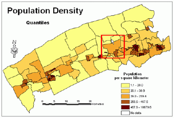
Data in a standardized choropleth map is normalized over the area from which the data is relevant. It converts the data into percentages so that the data can be compared over different areas. The map below shows the data after having been standardized in kilometers squared.

Univariate Choropleth Map
http://leistiar.wordpress.com/category/geography-techniques-projects/
A univariate choropleth map is a choropleth map that only uses one variable piece of data. It is essentially monochromatic as a result, and shows the relationship between location and the data in question. The map below is a series of four different univariate choropleth maps, all showing a different aspect of one variable in one color.

A univariate choropleth map is a choropleth map that only uses one variable piece of data. It is essentially monochromatic as a result, and shows the relationship between location and the data in question. The map below is a series of four different univariate choropleth maps, all showing a different aspect of one variable in one color.
Bivariate Choropleth Map
http://gis.stackexchange.com/questions/3087/what-makes-a-map-be-classed-as-badly-designed
In a bivariate choropleth map, two categories of data are being displayed visually using color on a map. Below, while technically a trivariate choropleth map, is as close as I could find to the map in question without referring to a map already used in 2010 Map Blogs, so I hope you'll cut me some slack. It shows 3 different choropleths, red, blue and magenta, all overlaid together so that the colors mix. It's clever, but you have to know your cover wheel to decipher it at all.

In a bivariate choropleth map, two categories of data are being displayed visually using color on a map. Below, while technically a trivariate choropleth map, is as close as I could find to the map in question without referring to a map already used in 2010 Map Blogs, so I hope you'll cut me some slack. It shows 3 different choropleths, red, blue and magenta, all overlaid together so that the colors mix. It's clever, but you have to know your cover wheel to decipher it at all.
Unclassed Choropleth Map
http://blog.revolutionanalytics.com/2009/11/choropleth-map-r-challenge.html
The difference between a classed and unclassed choropleth map is that in a classed choropleth, each color represents a certain data range, while a classed choropleth map has as many hue's as there are data points. In the map below, there is no information about what the map shows, but it is a great example of an unclassed choropleth because you can see at least 15 different shades of magenta on the map, all showing a unique value.

The difference between a classed and unclassed choropleth map is that in a classed choropleth, each color represents a certain data range, while a classed choropleth map has as many hue's as there are data points. In the map below, there is no information about what the map shows, but it is a great example of an unclassed choropleth because you can see at least 15 different shades of magenta on the map, all showing a unique value.
Classed Choropleth Map
http://my.ilstu.edu/~jrcarter/Geo204/Choro/
A classed choropleth map has the areal units combined into different rigid categories, each denoted by a defined shade of whatever color is used. It makes it so that the colors are easily distinguishable and can be referenced on the key on the left hand side to find an exactly or estimated ranged for the related numerical value.

A classed choropleth map has the areal units combined into different rigid categories, each denoted by a defined shade of whatever color is used. It makes it so that the colors are easily distinguishable and can be referenced on the key on the left hand side to find an exactly or estimated ranged for the related numerical value.
29 Range Graded Proportional Circle Map
http://www.e-cartouche.ch/content_reg/cartouche/cartdesign/en/html/ThemMaps_ThemData.html
Below is a RGPC map that shows the inhabitants in different areas of Zurich, which makes this a form of population density. The difference between a regular proportional circle map and this one is, this gives you a better feel for the actual value related to the size of the circle, as it has a range-grade on the right hand side that gives you an impression of the numerical correlation.

Below is a RGPC map that shows the inhabitants in different areas of Zurich, which makes this a form of population density. The difference between a regular proportional circle map and this one is, this gives you a better feel for the actual value related to the size of the circle, as it has a range-grade on the right hand side that gives you an impression of the numerical correlation.
Continuously Variable Proportional Circle Map
http://oliverobrien.co.uk/category/uncategorized/
Below is a continuously variable proportional circle map that shows... well, I don't really know what it does. It was so difficult finding a CVPC map that wasn't already on a previous semester's blogspot blog, that I had to dig deep, and this one unfortunately didn't have any labeling. But I do know what a CVPC map is, and that is a proportional circle map that shows a few different variables and shows how they related to one another by using varied circles, in this case, that are color coded.

Below is a continuously variable proportional circle map that shows... well, I don't really know what it does. It was so difficult finding a CVPC map that wasn't already on a previous semester's blogspot blog, that I had to dig deep, and this one unfortunately didn't have any labeling. But I do know what a CVPC map is, and that is a proportional circle map that shows a few different variables and shows how they related to one another by using varied circles, in this case, that are color coded.
DLG
http://en.wikipedia.org/wiki/Digital_line_graph
DLG is a digital vector form of a map distributed by the USGS, and are distrubuted in three different size-scales, large, intermediate and small, also included nine other categories of features. The below map is one compiled from USGS DLG data.

DLG is a digital vector form of a map distributed by the USGS, and are distrubuted in three different size-scales, large, intermediate and small, also included nine other categories of features. The below map is one compiled from USGS DLG data.
DRG
http://www.tceq.texas.gov/gis/drg.html
DRG stands for digital raster graphics. They are scanned copies of USGS topo-maps. The below map shows how the quality can be considered degraded compared to more modern resolutions. It shows the area surrounding the Colorado river near Walter Beach.

DRG stands for digital raster graphics. They are scanned copies of USGS topo-maps. The below map shows how the quality can be considered degraded compared to more modern resolutions. It shows the area surrounding the Colorado river near Walter Beach.
Isopleths
http://www.globalchange.umich.edu/globalchange1/current/lectures/kling/water_nitro/water_and_nitrogen_cycles.htm
An Isopleth is a line connecting the points on a map that show equal values of some variable, typically related to some geographical event, numerically. The map below shows the areas of US in regards to the pH value of rainfall in the different parts of the country paralleled to the area's sensitivity to atypically acidic rain.

An Isopleth is a line connecting the points on a map that show equal values of some variable, typically related to some geographical event, numerically. The map below shows the areas of US in regards to the pH value of rainfall in the different parts of the country paralleled to the area's sensitivity to atypically acidic rain.
Isohyets
http://www.scoop.co.nz/stories/AK0808/S00090.htm
Isohyets are lines over a map that connect points of equal rainfall at a given time. The below map shows these isohyets originating around an area of very high rainfall in New Zealand in between New Plymouth and Stratford.

Isohyets are lines over a map that connect points of equal rainfall at a given time. The below map shows these isohyets originating around an area of very high rainfall in New Zealand in between New Plymouth and Stratford.
Isotachs
http://www.erh.noaa.gov/btv/events/28Oct2008/ua2.php
Isotachs are lines that flow over a map and are used to display points of equal windspeed.The map below shows the wind as it travels over the US from a large developed system concentrated in the northern half of the United States.

Isotachs are lines that flow over a map and are used to display points of equal windspeed.The map below shows the wind as it travels over the US from a large developed system concentrated in the northern half of the United States.
Isobars
http://www.newmediastudio.org/DataDiscovery/Hurr_ED_Center/Hurr_Structure_Energetics/Closed_Isobars/Closed_Isobars.html
Below is a map of a fictitious piece of land that shows closed isobars around a low pressure system, and is a good example of how, much like a topographic map, isobars can represent the change in a value over space, such as here, as it shows barometric pressure increasing as it gets further from the center of low pressure.

Below is a map of a fictitious piece of land that shows closed isobars around a low pressure system, and is a good example of how, much like a topographic map, isobars can represent the change in a value over space, such as here, as it shows barometric pressure increasing as it gets further from the center of low pressure.
LIDAR
http://www.lidarbasemaps.org/
LIDAR (Light Detection and Ranging) is a form of remote sensing that makes use of lasers. It fires a laser at a target then measures the refracted returning light to produce information such as distance from the target that the laser impacted. Below is a software's translation of information achieved from a surface using LIDAR mapping.

LIDAR (Light Detection and Ranging) is a form of remote sensing that makes use of lasers. It fires a laser at a target then measures the refracted returning light to produce information such as distance from the target that the laser impacted. Below is a software's translation of information achieved from a surface using LIDAR mapping.
Doppler Radar
http://www.noaanews.noaa.gov/stories2004/s2311.htm
Below is a still of a computer screen that shows a translated image produced by Doppler radar of Hurricane Frances in September 4th, 2004 making landfall in Florida. Doppler radar is a method of producing images by making use of the Doppler effect as waves are sent through and bounce back to a radar. The variation of the returning wave's frequency gives information based on, in this instance, a hurricane's location, density and traveling speed among other things.

Below is a still of a computer screen that shows a translated image produced by Doppler radar of Hurricane Frances in September 4th, 2004 making landfall in Florida. Doppler radar is a method of producing images by making use of the Doppler effect as waves are sent through and bounce back to a radar. The variation of the returning wave's frequency gives information based on, in this instance, a hurricane's location, density and traveling speed among other things.
Black and White Aerial Photography
http://jhlab.wordpress.com/2010/09/
Black and white aerial photography is a form of remote sensing that was used heavily in the mid-1900s that effectively shows land masses and ground features. The blow picture shows a large residential and commercial part of Rochester, NY from several miles up.

Black and white aerial photography is a form of remote sensing that was used heavily in the mid-1900s that effectively shows land masses and ground features. The blow picture shows a large residential and commercial part of Rochester, NY from several miles up.
Infrared Aerial Photo
http://www.aerialarchives.com/Infrared-Aerial-Photography.htm
This image shows an photograph taken using infrared aerial photography of the Sacramento river deep water shpi channel and levees in the San Joaquin river delta. This is a prime example of the power of Infrared Aerial Photography because it shows how differently this method of mapping captures information below. It is a tool that is great for showing changes in the environment, such as wetlands and forests because those show up differently using infrared imaging, opposed to real color photography.

This image shows an photograph taken using infrared aerial photography of the Sacramento river deep water shpi channel and levees in the San Joaquin river delta. This is a prime example of the power of Infrared Aerial Photography because it shows how differently this method of mapping captures information below. It is a tool that is great for showing changes in the environment, such as wetlands and forests because those show up differently using infrared imaging, opposed to real color photography.
Cartographic Animation
http://en.wikipedia.org/wiki/Animated_mapping
This is a .gif that serves as a cartographic animation of the 2004 Indonesian tsunami. It shows the point of origin as it travels across the ocean and impacts land. Cartographic animation is a form of mapping that uses an animated image to show a change or a process developing such as a hurricane traveling or temperature changes as seen on a radar projection on a televised weather station to show a moving change overtop of a map.

This is a .gif that serves as a cartographic animation of the 2004 Indonesian tsunami. It shows the point of origin as it travels across the ocean and impacts land. Cartographic animation is a form of mapping that uses an animated image to show a change or a process developing such as a hurricane traveling or temperature changes as seen on a radar projection on a televised weather station to show a moving change overtop of a map.
Statistical Map
http://www.wikivolunteer.com/analytic-maps.html
This is a statistical map that shows the percentage of change in the population of residents for the states in the US from the 90's to 2000. A statistical map is a map that displays a statistical factor such as population or changes in rainfall on a map so as to relate location to a change in the factor being measured.

This is a statistical map that shows the percentage of change in the population of residents for the states in the US from the 90's to 2000. A statistical map is a map that displays a statistical factor such as population or changes in rainfall on a map so as to relate location to a change in the factor being measured.
Cartogram
http://theelectoralmap.com/2008/03/02/politics-online-conference-cartograms/
This is a cartogram that shows the voting percentages of the Democratic primary in the year in which Barack Obama was running against Hillary Clinton in the US. The overall shape of North America is vastly distorted and barely recognizable. This is because area is determined by variables based not on shape and size, so instead of getting a locationally accurate map, the shape is shrunk or wildly blown out of proportion.

This is a cartogram that shows the voting percentages of the Democratic primary in the year in which Barack Obama was running against Hillary Clinton in the US. The overall shape of North America is vastly distorted and barely recognizable. This is because area is determined by variables based not on shape and size, so instead of getting a locationally accurate map, the shape is shrunk or wildly blown out of proportion.
Proportional Circle Map
http://geomediablog.com/2008/03/26/proportional-circle-maps-in-geomedia/
This is a proportional circle map that shows the populations of different regions in the cities of Indonesia. The circles here are proportional to the variable that was being measured, in this case, population, to give a relativistic way of visually expressing a number through the area of the circle.

This is a proportional circle map that shows the populations of different regions in the cities of Indonesia. The circles here are proportional to the variable that was being measured, in this case, population, to give a relativistic way of visually expressing a number through the area of the circle.
Flow Map
http://en.wikipedia.org/wiki/Flow_map
This is a flow map of the countries bordering the Atlantic ocean that depicts the quantities and direction of the flow of French wine out of France to their ultimate destination. This is a good example of a flow map because it shows the one directional nature of exports in a concise and quantitative way easily to the viewer.
This is a flow map of the countries bordering the Atlantic ocean that depicts the quantities and direction of the flow of French wine out of France to their ultimate destination. This is a good example of a flow map because it shows the one directional nature of exports in a concise and quantitative way easily to the viewer.
Isoline Map
http://www2-pcmdi.llnl.gov/cdat/tutorials/cdatbasics/plotting-basics/modifying-isoline-plot
This is a map of the continents of the world and shows the isolines of either temperatre or barometric pressure. It is a isoline map because each of the lines that form an enclosed area show the point at which the measured quantity of temperature/pressure changes as you traverse the map.

This is a map of the continents of the world and shows the isolines of either temperatre or barometric pressure. It is a isoline map because each of the lines that form an enclosed area show the point at which the measured quantity of temperature/pressure changes as you traverse the map.
Choropleth Map
http://my.ilstu.edu/~jrcarter/Geo204/Choro/Tom/
This is a map of Florida that displays the percentage of Hispanics in Florida by county. The more white-leaning the color, the lower the percentage and the darker green the color in each county, the heavier the percentage of Hispanic or Latino individuals. This is an example of a choropleth map because it is a thematic map that correlates a certain factor to location and distinguishes that visually using color.

This is a map of Florida that displays the percentage of Hispanics in Florida by county. The more white-leaning the color, the lower the percentage and the darker green the color in each county, the heavier the percentage of Hispanic or Latino individuals. This is an example of a choropleth map because it is a thematic map that correlates a certain factor to location and distinguishes that visually using color.
Dot Distribution Map
http://en.wikipedia.org/wiki/Dot_distribution_map
The below map is a dot distribution map made by John Snow of London. Each dot represents the residence of someone who had contracted cholera in 1854. This map shows the connection between proximity and the spreading of the disease, and because of that, illustrates the usefulness of dot density maps to displaying a correlation between location and another measurement of interest.
Propaganda Maps
http://geocurrents.info/geonotes/maps-as-an-instrument-of-propaganda-part-1
The map below depicts Europe and Western Asia in a light, comical but overall anti-Russian point of view. It shows the Russian Tsar Nicholas the II in 1899 hanging over the remainder of Europe in a way meant to communicate to the viewer, making this map a propaganda map.
Hypsometric Map
http://www.globalmapperforum.com/forums/elevation-data/6944-does-global-mapper-support-hypsometric-tinting.html
The map below shows an area of a small mountain range or semi-mountainous with an intricate river system running through it. It uses tinting, a tilted angle of viewing, and color to show the changes in elevation between mountain peaks and the lowest points leading out to a lake or ocean as the river winds its way down. It is a prime example of a hypsometric map because, while not using lines of equal elevation, it does perfectly display height using tinting.
PLSS Map
http://www.rootsweb.ancestry.com/~alfrankl/landrecords.htm
This is a perfect example of a PLSS map because it is zoomed out far enough to get a feel for what it displaying. It uses a larger scale to depict the area of the townships and ranges in Franklin County in Alabama, while still showing the markings on the side to display the PLSS coordinates of a location.

This is a perfect example of a PLSS map because it is zoomed out far enough to get a feel for what it displaying. It uses a larger scale to depict the area of the townships and ranges in Franklin County in Alabama, while still showing the markings on the side to display the PLSS coordinates of a location.
Cadastral Maps
http://en.wikipedia.org/wiki/Cadastre
This is a cadastral map of the area of Pielnia in 1852 Austria. It is a prime example of a cadastral map because it shows the size, relative location and ownership of different pieces of property and land on this particular country side. I assume that this many acres is owned by S. Johann der Taufer, and each of the strips of land are farm plots or unoccupied property.
Thematic Maps
http://www.mapsofworld.com/usa/thematic-maps/
This is a thematic map showing the connection between which parts of the US grow what quantities of barley, cotton and corn. It could potentially be argued from this map that certain climates have proven to be better for yielding different types of crops, out of these three crops. It is a thematic map because it shows a locational relationship between an area or a people to another characteristic, in this case, agricultural focus/contribution.
Topographic Map
http://en.wikipedia.org/wiki/Topographic_map
This map shows an interesting topographic map of Nablus, an area just north of Jerusalem on the West Bank. This is a good example of a topographic map because it has easily distinguished intervals of 100m between each degree of height-lines throughout. It also has coded the areas of equal elevation by color as well, making it considerably easier to distinguish elevation changes than how it is done on typical topographic maps.

This map shows an interesting topographic map of Nablus, an area just north of Jerusalem on the West Bank. This is a good example of a topographic map because it has easily distinguished intervals of 100m between each degree of height-lines throughout. It also has coded the areas of equal elevation by color as well, making it considerably easier to distinguish elevation changes than how it is done on typical topographic maps.
Planimetric Map
http://egsc.usgs.gov/isb/pubs/booklets/usgsmaps/usgsmaps.html
This is a transcriped map of an overhead view of down town New Orleans, Louisiana. It shows the road systems, block structure, and several notable buildings. It is a planimetric map because it shows strictly the horizontal location of information on the surface, relative to each other. Maps like this one are able to show significant amounts of useful navigational information despite only being a two dimensional horizontal sliver.
Mental Map
Alright, so this first one is a bit of a long shot but is something I argued in the past. This is a painting called Landscape with House and Ploughman by Vincent van Gogh. It's an oil painting, and is essentially a landscape with a few other features in it. I would argue that this is a mental map because while a lot of what Van Gogh did was draw from life, he also drew from imagination, and in particular, from his memory. It's impossible to say if this exact painting was painted from his memory of a landscape, but for this assignment, allow me to argue that it is. That would mean that the way he paints illustrates his mental map of this particular area, distance between farm plots, the way the trees are organized on the acreage, the proximity to the mountains, the colors, are all indicative of how he perceived the area, and thus, make this a mental map.
Subscribe to:
Posts (Atom)